RGB vs. CMYK: What’s the Difference?
I’m very, very thorough when it comes to supplying final logo files to clients. Each logo variation is separated by its orientation, colour, and file type via a well-organised folder system that satisfies all of my OCD tendencies. The first tier of that system? CMYK, and RGB. Have I lost ya yet?
What I see as a simple and logical filing system, those who don’t have a Glossary of Graphic Design in their brains can see this as an overwhelming mish-mash of meaningless words and files that on the surface, all look the same (they aren’t, I swear). In fact, I often find myself sending a client their final files and beginning the handover with “Don’t panic! I’m about to explain everything…”
First thing’s first, what exactly is RGB and CMYK?
Both RGB and CMYK are types of colourspaces. The RGB colourspace is used for all digital applications. Yep, that means every screen that you view content on. All colours, logos, photos and videos are in RGB, and every single colour is created by mixing Red, Green, and Blue (RGB) to produce pretty much any colour under the sun (nearly 17 million in fact, which is technically around 16 million more than the human eye can see, but my brain can’t process that right now).
In contrast, CMYK is best for all print processes, with this term referencing the four print plates used on the ol’ traditional printing press. Specifically, varying levels of Cyan, Yellow, Magenta, and Black (okay, technically the ‘K’ stands for Key, but let’s say black for simplicity) inks are mixed to create all printed collateral. In fact, if you grab a magnifying glass and look closely at a page in a magazine, you’ll likely see a bunch of cyan, yellow, magenta, and black dots that are layered to create a final, perceived colour. It’s a bit like magic, really.
Side note: There’s also this thing called PMS, which refers to spot colours within the Pantone Matching System. This is kind of an extension of CMYK in that they’re used in printing, but are singular, pre-mixed colours that guarantee consistency no matter which print company you use. This means they’re expensive, but more on that later.
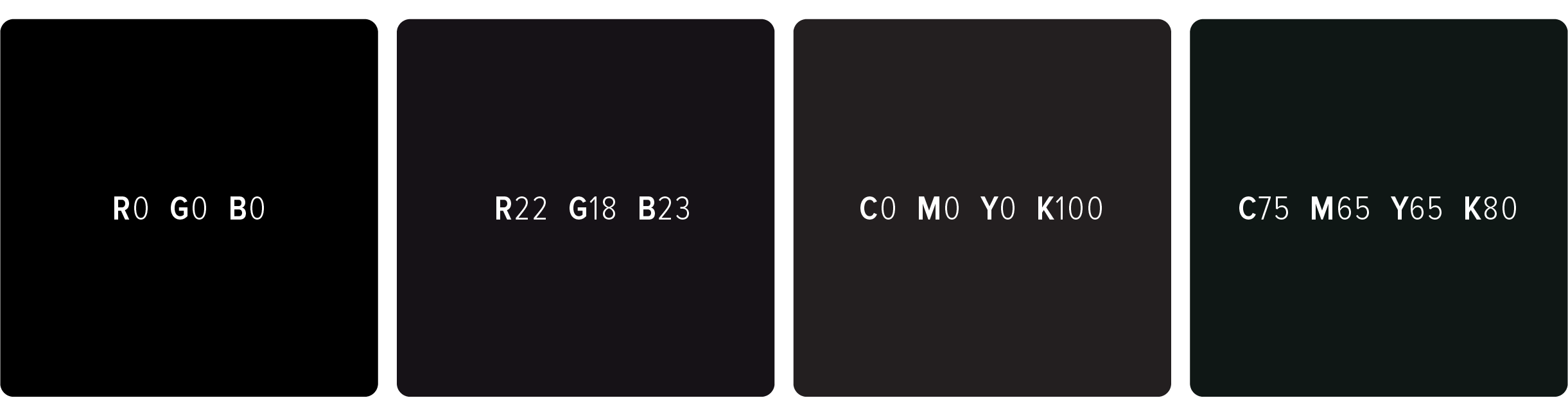
I did an Instagram post a while ago showing the difference between blacks, determined by the different ways RGB and CMYK values can be mixed to create a massive range of black tones. Who woulda thunk there was more than one type of black? Let’s take a look… (and yes, technically the CMYK swatches below have converted to RGB for you to view on-screen, but the comparison can still be made. I can totally understand how all of this colour stuff is hard to get your head around, mine included!)
What’s the biggest downfall between the two colourspaces?
Easy. Although CMYK mixes four colours rather than RGB’s three, CMYK ironically isn’t able to produce anywhere near the same number of colours as in the RGB spectrum. That’s great for RGB (and using your branding in the digital world), but can often create problems when it comes to print collateral. The worst colour for this? Purple. Purples in the RGB colourspace can be wonderfully bright, but unfortunately, it’s impossible to get these same qualities in print given the lack of CMYK colours available. Once printed, the previously vibrant colour swatch is now dull and murky. Check out this comparison showing the CMYK conversion of a pre-selected RGB purple.
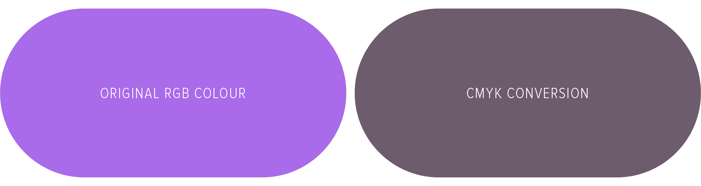
Crazy, huh? Although a direct conversion, there would inevitably be quite the difference between digital and print applications if a company were to use this as their brand colour. This makes it hard for potential customers to recognise the brand across the two mediums plus creates visual inconsistencies. And inconsistencies detract from how professional a brand is perceived to be. The lesson? When creating a colour palette, it’s so important to consider how these look as both RGB and CMYK swatches (if a brand requires both an online and physical presence, that is) to ensure consistency.
It’s also worth noting that, despite how good of a match a colour is across the two colourspaces, printed colours will naturally be more dull compared to RGB. Remember, the brightness of screens are determined by light, where ink sinks into paper and absorb light. Likewise, all screens, paper, printing machines, and even print companies treat colour differently, so it’s unlikely your colours will look 100% accurate across the board (just to keep you on your toes). Having a good designer on board (oh, hey there!) will help to manage expectations and produce the best possible result.
What if I use the wrong colourspace?
Let’s be real, it won’t be the end of the world if this happens. But, a large part of my job is to ensure you have the tools, knowledge, and confidence to use your logo and branding consistently and as accurately as possible. If you’re working direct with a print company, they should let you know if you’ve sent them something in RGB, or request CMYK files upfront. The same can’t be said for uploading digital assets—if you accidentally upload your CMYK logo file to your Insta account for example, it’ll automatically convert to RGB (however this likely won’t be the same RGB breakdown as what’s in your official RGB logo files—fun), so it’s best to upload the correct files from the get-go.
In summary…
Use your RGB files for on-screen use, and CMYK files for printing.