Always Look for the Penis
Get ya mind out of the gutter, folks! Although, that’s kind of the point of this blog. Hear me out…
A fellow graphic designer once told me to “always look for the penis”, to which I responded with an appropriately afraid look. She then elaborated by explaining this in the context of logo design. *sigh of relief*
Creating a logo for your brand is an incredibly creative, yet delicate, task. It’s (generally) the first thing a potential customer will see, and it really sets the tone for your brand experience and how you’re perceived and remembered by clients.
Logo design starts with one very important thing: a brief.
From this brief, the designer will put together a concept or two and it’s at this point that both the designer and client need to look at the design objectively, and look for things that perhaps weren’t intended to be there. Such as; a penis, phallic forms; culturally inappropriate symbols or concepts. In essence, something not aligned with what your brand offers. Let’s check out two examples, can you spot the faux pas?

It's—unfortunately—easy to create a design that includes a shape or symbol that can be misinterpreted as offensive or super inappropriate. How? Because both designer and client are naturally close to the project, meaning both are looking for things that meet the brief rather than the things that don’t. In saying that, a good designer (hi) should have the ability to mitigate these types of risks and think critically.
Here are a few other examples, and this time Italy-based designer, Emanuele Abrate, has redesigned them to better fit the original briefs:
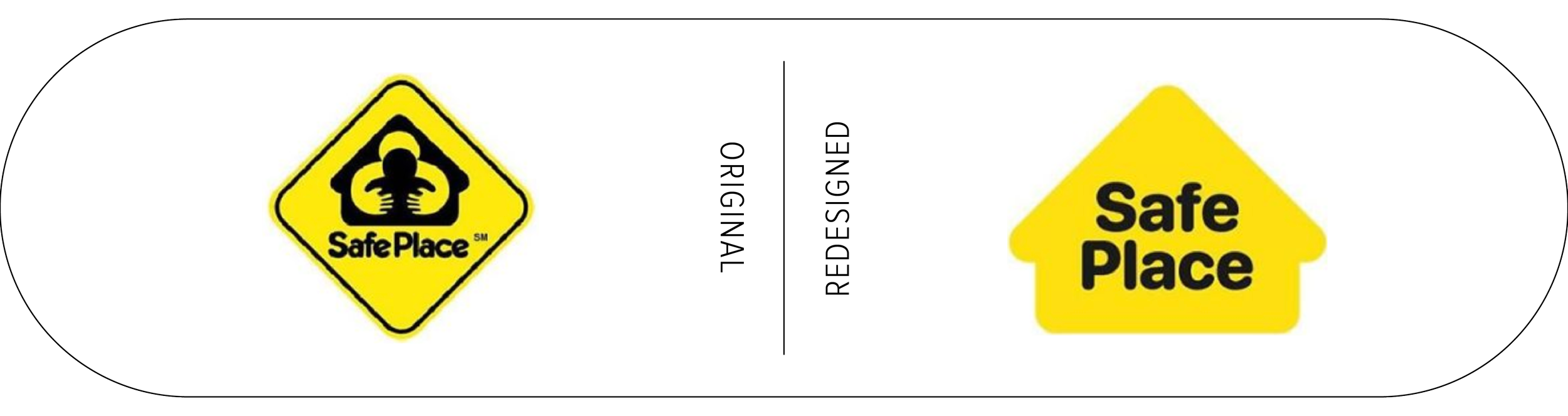

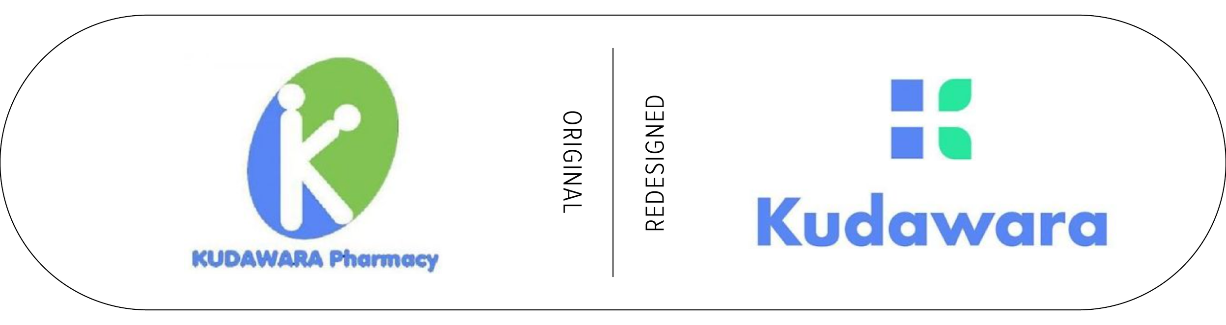
Emanuele believes there are many problems with this logo namely:
“…a poor use of typography, disproportionate elements, and the defective use of shapes that creates an ambiguous message.”
Launching an accidentally inappropriate logo could lead to serious consequences for your brand, such as damaging your reputation and hurting sales (for the designer, too!) plus it means a costly and time-consuming rebrand becomes an imminent necessity. The best way to avoid this situation is to triple-check your logo from concept through to execution—a fresh pair of (objective) eyes are great for this. Look at the forms and make sure that it can’t be misconstrued as anything rude or inappropriate, and it helps to consider the context in which the logo will be used. For example, the design should be tested at different resolutions and sizes to make sure that it can’t be misinterpreted when reduced to its most basic form.
Most importantly, take your time.
Make sure your logo accurately and effectively represents your brand and appeals to your client base. This includes looking for the things that shouldn’t be there. Like a penis.